Lesson 14
Why Buy Every Color on the Market?
It is a known fact that we cannot derive primary colors by mixing colors. Primary colors are red, yellow and blue, and no combination of colors out there can create them. They are what they are. Now, I am speaking of the real, true red, yellow and blue...and not the ones that have other colors in them.
I was playing around with mixing colors on my palette the other day and decided that I should share some of what I learned. My favorite red, yellow and blue are Opera (which is really a hot pink), Cadmium Red Light is the other favorite red (which has yellow in it). |
Also visit:
Paints
to learn about different brands
|
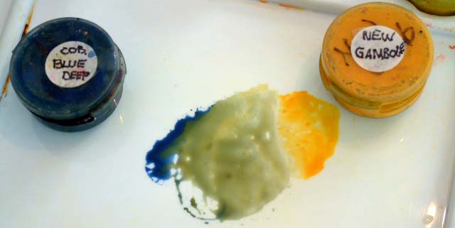
For a dark red, I use Perylene Maroon or Alizarin Crimson. New Gamboge and Hansa Yellow and Quinacridone Gold are my favorite yellows, and Cobalt Blue Hue, Cobalt Blue Deep are my favorite blues. There are others, of course, but lets see what we can do with just these few colors.
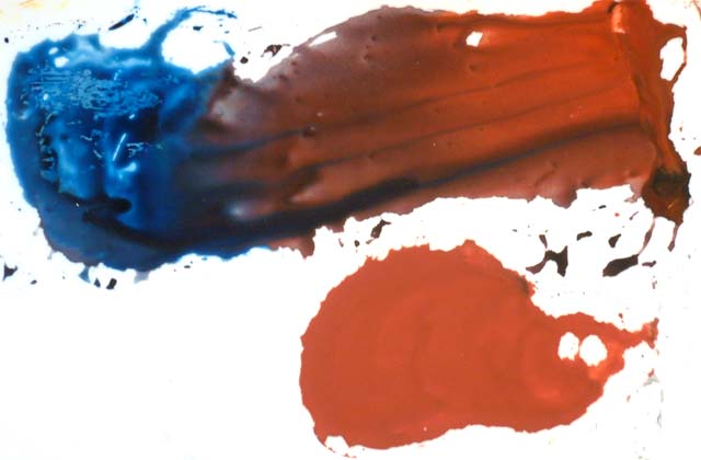
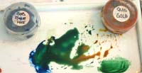
 I mixed Cobalt Blue Hue and Cadmium Red Light and the result was Indian Red! There is just enough density in the Cadmium Red Lite to make it an opaque color, like the true Indian Red. I was amazed. This Indian Red color is best used for opaque subjects such as bricks and clay pottery. I mixed Cobalt Blue Hue and Cadmium Red Light and the result was Indian Red! There is just enough density in the Cadmium Red Lite to make it an opaque color, like the true Indian Red. I was amazed. This Indian Red color is best used for opaque subjects such as bricks and clay pottery.
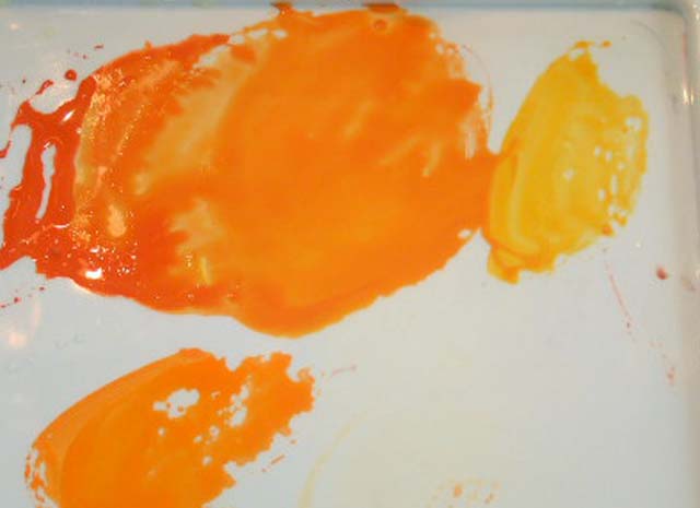
Mixing colors Hansa Yellow with Cadmium Red Light resulted in a color as close to Cadmium Orange as any combination I have tried before. When mixing colors New Gamboge with the Hansa Yellow, the result was close but not quite as accurate.
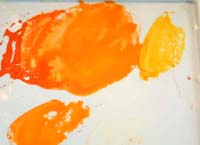 I also mixed a color near to this with Cadmium Red Light and New Gamboge. You can see the actual Cadmium Orange swatch at the bottom. Either combination works. I also mixed a color near to this with Cadmium Red Light and New Gamboge. You can see the actual Cadmium Orange swatch at the bottom. Either combination works.
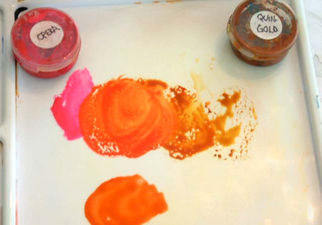
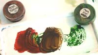
 Quinacridone Gold and Opera make a vibrant Red Orange. It is similar to Burnt Sienna but more transparent. You can see the swatch of Burnt Sienna at the bottom of the illustration. I don't actually have Burnt Sienna on my palette anymore. It is so easy to mix. Quinacridone Gold and Opera make a vibrant Red Orange. It is similar to Burnt Sienna but more transparent. You can see the swatch of Burnt Sienna at the bottom of the illustration. I don't actually have Burnt Sienna on my palette anymore. It is so easy to mix.
Because Opera and Cadmium Red Lite are medium value hues, you would need to have a dark red on your palette for mixing darker colors. Alizarin Crimson is probably the most powerful dark red. It mixes well with many colors. Try it!
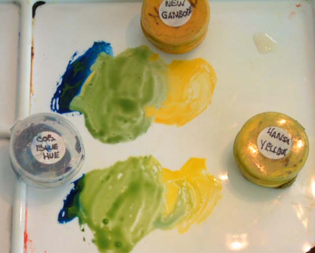
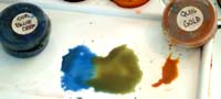
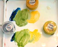 Using Cobalt Blue Hue with New Gamboge makes a cool green, and when mixed with Hansa Yellow the results is the same as LeafGreen (or a light Sap Green). If more pigment is used it can appear to be as dark as Permanent Sap Green. The two mixtures are in this illustration. Any of these combinations can change depending on how much of each pigment is used in the mixture. Using Cobalt Blue Hue with New Gamboge makes a cool green, and when mixed with Hansa Yellow the results is the same as LeafGreen (or a light Sap Green). If more pigment is used it can appear to be as dark as Permanent Sap Green. The two mixtures are in this illustration. Any of these combinations can change depending on how much of each pigment is used in the mixture.
 When mixing colors Cobalt Blue Hue with Quinacridone Gold, the result is more likeHooker's Green. It is a bluer green than Sap Green, and can be made quite dark because the Cobalt Blue Deep is a dark color. I prefer this blue to French Ultramarine Blue as it does not granulate quite as much on the paper. However, there is always a place for the French Ultramarine if texture is needed in a painting. When mixing colors Cobalt Blue Hue with Quinacridone Gold, the result is more likeHooker's Green. It is a bluer green than Sap Green, and can be made quite dark because the Cobalt Blue Deep is a dark color. I prefer this blue to French Ultramarine Blue as it does not granulate quite as much on the paper. However, there is always a place for the French Ultramarine if texture is needed in a painting.
The Hookers Green swatch is at the bottom right of the image. They are very close in hue. So you see you do not need to purchase every tube of paint at the store.
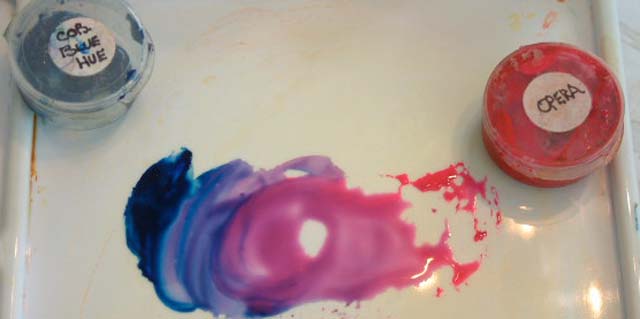
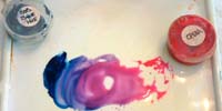 Now let's make purples. My very favorite mixture is with Cobalt Blue Hue and Opera. The combination makes a beautiful clear lavenderand even purple too. Because this is a medium value hue, I use it in shadows along with a touch of Q-Gold, keeping in mind not to mix the colors together, but let them mingle on the paper. It is very pleasing to the eye. Now let's make purples. My very favorite mixture is with Cobalt Blue Hue and Opera. The combination makes a beautiful clear lavenderand even purple too. Because this is a medium value hue, I use it in shadows along with a touch of Q-Gold, keeping in mind not to mix the colors together, but let them mingle on the paper. It is very pleasing to the eye.
 This is a wonderful combination when painting flowers. So many are a delicate lavender, such as Hydrangeas, some bearded Irises, Lilacs, etc. And because you have mixed it from two colors, you can vary the hue at your whim, from a pinkish lavender to a bluish lavender. It is even good for painting lavender! This is a wonderful combination when painting flowers. So many are a delicate lavender, such as Hydrangeas, some bearded Irises, Lilacs, etc. And because you have mixed it from two colors, you can vary the hue at your whim, from a pinkish lavender to a bluish lavender. It is even good for painting lavender!
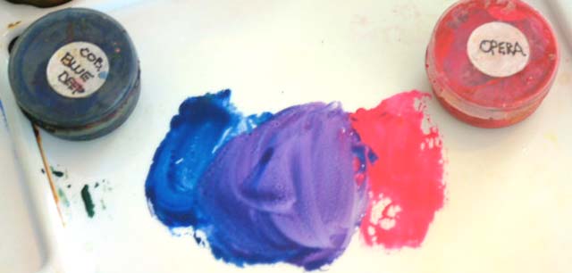
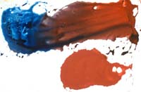
If you need a dark rich purple, use Cobalt Blue Deep and Opera. Because neither of those colors have yellow in them as a sub-dominant, the result is clean and clear. This is a great color for Japanese Irises.
 But when you use Cobalt Blue Deep and Cadmium Red Light (which has lots of yellow in it) you are using a triad of color which makes the results a grayed color. The purple is almost brown. Although, if more blue is mixed in, the color becomes cooler and more blue purple. The result is not a clear color but a grayed color which can be used successfully in a painting to offset the bright colors of the main subject matter. But when you use Cobalt Blue Deep and Cadmium Red Light (which has lots of yellow in it) you are using a triad of color which makes the results a grayed color. The purple is almost brown. Although, if more blue is mixed in, the color becomes cooler and more blue purple. The result is not a clear color but a grayed color which can be used successfully in a painting to offset the bright colors of the main subject matter.
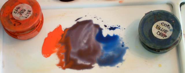
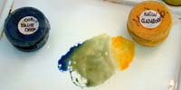 New Gamboge and Cobalt Blue Deep make a nice gray green. This is great for the foliage in the desert. I can remember telling one of my students that her green was not green enough. I had never been out west at the time and didn't know that the desert greens were so gray! Now I know! The traditional Cobalt Blue also makes a gray green. I think this is because both of these blues have a red sub-dominant color in them so there you have the "triad" that creates grays. New Gamboge and Cobalt Blue Deep make a nice gray green. This is great for the foliage in the desert. I can remember telling one of my students that her green was not green enough. I had never been out west at the time and didn't know that the desert greens were so gray! Now I know! The traditional Cobalt Blue also makes a gray green. I think this is because both of these blues have a red sub-dominant color in them so there you have the "triad" that creates grays.
 When mixing colors Cobalt Blue Deep with Q-Gold, the resulting color is a rich dark gray green, with an olive green flair. This is probably because the Q-Gold has so much red in it. When mixing colors Cobalt Blue Deep with Q-Gold, the resulting color is a rich dark gray green, with an olive green flair. This is probably because the Q-Gold has so much red in it.
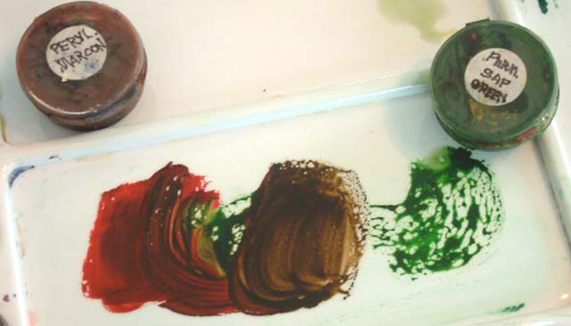
 My last example will be for rich warmbrowns. I mix Perylene Maroon with Permanent Sap Green. I suppose I could mix the Sap Green as I did earlier in this dialog, but I happen to have it on my palette as a back up, and for expediency, since I use lots of browns in woodland scenes. My last example will be for rich warmbrowns. I mix Perylene Maroon with Permanent Sap Green. I suppose I could mix the Sap Green as I did earlier in this dialog, but I happen to have it on my palette as a back up, and for expediency, since I use lots of browns in woodland scenes.
When I first began painting, I used Van Dyke Brown for a warm brown and Sepia for a real dark brown, but I think it is just too "dead". If I need to make the rich warm brown a bit more flat, I can always add a drop of blue.
Try mixing colors that you have in your cupboard, and find the ones that work for you. There is no need to purchase every color in any company's collection. The colors I have used here are from Winsor Newton, Holbein and Daniel Smith. There are many other good manufacturers of pigments.
Read books on art, magazine articles and find colors that artists use that you might like. You are sure to purchase more than you need, but you will soon find the balance.
<<Return to Lesson 13: Using Green
Advance to Lesson 15: Using brushes>>
Watercolor Painting Tips
Return to Watercolor Lessons
Return to Watercolor Techniques

|